Power BI · Custom Visual
The Lipstick Bullet Chart
A free, open-source Power BI custom visual that packs actual value, target, completion % and variance into a single compact, information-dense element. Born in Data Studio — now native in Power BI.
⬇ Download .pbiviz View on GitHub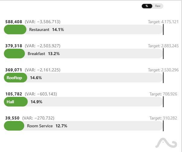
Click to zoom · Lipstick Chart in Power BI
What it does
The Lipstick Bullet Chart is built for anyone who needs to compare actual performance against a target across multiple categories — without resorting to a cluttered table or a column chart forest.
Each row in the visual encodes four values simultaneously:
- Actual value – rendered as the "lipstick" bar fill.
- Target value – the reference benchmark marker.
- Completion % – progress toward the goal, shown numerically and through the bar length.
- Absolute variance – the raw gap between actual and target, color-coded as positive or negative.
This effectively replaces the need for a separate KPI card, a bar chart, and a data table — all in a single, responsive visual element.
From Data Studio to Power BI
This visual started life as a community visualization for Google Data Studio (Looker Studio) . I originally built it using the DSCC API and D3.js to fill a very specific gap: a way to scan dozens of KPIs at a glance in management reports without toggling between multiple chart types.
Porting it to Power BI meant moving from a JavaScript DSCC bundle to a
full TypeScript + Power BI SDK project, implementing
the IVisual interface, and wiring up the formatting pane
through the capabilities JSON. The result is a .pbiviz file
you can sideload into any Power BI Desktop report in under a minute.
Key features
4 metrics, 1 element
Actual, target, completion % and variance rendered in a single compact bar — no need for separate visuals.
Formatting pane
Colors, label visibility, bar thickness and padding are all configurable directly from the Power BI formatting pane.
Responsive sizing
The visual adapts to any container size — works in a narrow card or across a wide dashboard panel.
Multi-category support
Bind a dimension field to render a row per category — regions, products, channels — all in one scrollable list.
Conditional coloring
Variance and fill color flip automatically based on whether the actual is above or below target.
Free & open-source
MIT licensed. Download the .pbiviz, inspect the source on
GitHub, fork it — no strings attached.
In the wild: sample dashboard
Below is a screenshot of the Lipstick Chart used inside a full Power BI dashboard alongside native visuals. It sits naturally next to cards, slicers and matrix tables without visual friction.
/assets/imgs/powerbi/lipstick_dashboard.jpg Full Power BI dashboard using the Lipstick Bullet Chart for regional sales vs. target analysis.
Download & install
Sideload the .pbiviz into Power BI Desktop or grab the sample
report to see it wired up with demo data.
Lipstick Bullet Chart .pbiviz
The compiled custom visual file. In Power BI Desktop go to Insert → Get more visuals → Import a visual from a file and select this file.
⬇ Download .pbivizDemo dashboard .pbix
A complete Power BI report file with sample data pre-wired to the visual. Open it directly in Power BI Desktop — no setup needed.
⬇ Download .pbixGitHub repository
Full TypeScript source, build instructions, and the capabilities JSON. Fork it, adapt it, or submit a PR.
View on GitHub →How to install in 60 seconds
- Download the
.pbivizfile above. - Open Power BI Desktop and open (or create) a report.
- In the Visualizations pane click the three-dot menu → Import a visual from a file.
- Select the downloaded
.pbivizand confirm the security prompt. - The Lipstick Chart icon appears in your Visualizations pane. Drag it onto the canvas and bind your Category, Value and Target fields.
More custom visualizations
This started in Data Studio
The Lipstick chart is part of a broader set of custom visuals I've built for Google Data Studio (Looker Studio) — Tree Hierarchy, Histogram, Cleveland Plot and more.
See the Data Studio visuals →