Data Studio (formerly Looker Studio) Community Visualizations
Custom community visualizations I've developed for Google Data Studio (formerly Looker Studio), extending its capabilities with specialized chart types for better data storytelling.
Visualizations Included
-
 Lipstick Chart - A specialized chart type for comparing real values against targets with a distinctive, high-density visual style.
 -
 Tree Hierarchy - A hierarchical visualization for displaying multi-level data structures with intuitive drill-down capabilities.
 -
 Histogram - A customizable histogram with options for orientation, log scale, and axis visibility for distribution analysis.
 -
 Sparkline Table - A data-dense table with embedded sparklines for tracking trends at a glance.
 -
 Cleveland Plot - A clean alternative to bar charts for comparing values or showing distributions.
 -
 Custom KPI - A minimalist KPI card design with 'minimal pause' aesthetics for clear metric impact.
 -
 Matrix Heatmap - A data-dense visualization for exploring correlations, distributions, and intensity across two dimensions with customizable color scaling.
 -
 Radar Chart - Plots multi-dimensional metrics on polygonal or circular webs using tidy or wide data models.
 -
 Text Card Grid - Presents descriptive text blocks alongside quantitative metrics in responsive column grids or chronological timelines.
 -
 Bar & Lollipop Deviation - A vertically concatenated dual chart showing deviation to plan (lollipops) and actual vs plan comparisons (bars and ticks) with customizable grids and dynamic color matching.
 -
 Icicle Chart - An interactive, multi-level hierarchy visualization supporting vertical/horizontal orientations, custom breadcrumbs, high-fidelity tooltips, and click-to-zoom.
Below you can see detailed demonstrations and technical explanations for the primary visualizations.
Lipstick Chart: Value vs. Target Analysis
The Lipstick Visual is a powerful tool designed to compare current performance against specific targets. It excels at breaking down metrics across various dimensions, for example, comparing Actual Revenue from different regions against their Expected Targets.
By combining multiple data points into a single graphical element, it provides a comprehensive view at a glance:
- Completion Percentage: Visual progress towards the goal.
- Real Metric Value: The absolute current figure.
- Target Value: The benchmark or budget.
- Absolute Variation: The calculated gap between both values.
- Optional Dimensions: Dynamic breakdown across secondary details or category grouping levels.
- Secondary Targets: Concentric dashed end-caps and straight lines representing stretch goals.
- Togglable Views: An interactive axis scale toggle to swap between percentages and absolute metrics on the fly.
Tree Hierarchy in Action
The Tree Hierarchy visualization allows users to navigate through multi-level data structures intuitively. By clicking on nodes, users can drill down into specific categories, while smooth transitions maintain context and energy flow.
This video showcases the drill-down capabilities, responsive layout, and interactive node selection features of the tree structure.
Qualitative Narrative Card Grid
The Text Card Grid presents descriptive narrative text fields side-by-side with quantitative indicators. It adapts layout behaviors depending on the user's focus:
- Layout Switcher: Swap dynamically between a responsive card grid, a vertical timeline feed, and a split-screen reader.
- Design Flexibility: Automatically restructures the card layout to organize titles, subtitles, category tags, and descriptive text fields.
- Metric KPI Labels: Integrates quantitative data fields alongside narrative text blocks using your custom field formatting.
- Natural Spacing: Preserves paragraph breaks, spacing, lists, and double carriage-returns to retain original document readability.
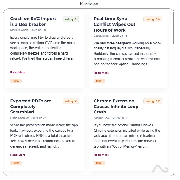
Primary Use Cases: Real-world applications include interactive customer review lists with NPS filtering, centralized developer component portfolios, and chronological version changelogs.
Why Use Custom Community Visualizations?
While Google Looker Studio offers a robust set of default charts, some complex data structures require specialized visual approaches. Custom community visualizations fill this gap by allowing developers to build unique, interactive charts using D3.js and the DSCC API.
Key benefits include:
- Branded Reporting: Tailor the look and feel of your data to match your brand identity.
- Advanced Interaction: Implement complex drill-down behaviors and cross-filtering.
- Specialized Charts: Use non-standard charts like Tree Hierarchies or Lipstick charts for more effective communication.
Frequently Asked Questions
1. What is a Data Studio (Looker Studio) Community Visualization?
It's a third-party chart developed using the Google Data Studio (formerly Looker Studio) Community Visualization API. It allows for custom rendering and interaction that goes beyond standard built-in components.
2. How do I install these custom visualizations?
You can add them to your report by using the "Community Visualizations and Components" icon in the Data Studio toolbar and pasting the manifest path provided (available upon request).
3. Are these visualizations responsive?
Yes, all visualizations shown here are built to be fully responsive and adapt to the size of the container within your Data Studio (Looker Studio) report.
Technical Details
These visualizations are built using the Data Studio (Looker Studio) Community Visualization API (DSCC) with JavaScript and D3.js for rendering. They are designed to be highly configurable through the Data Studio style panel.
Tech & skills: JavaScript, D3.js, DSCC API, Data Visualization, CSS.