Data analysis & dashboards
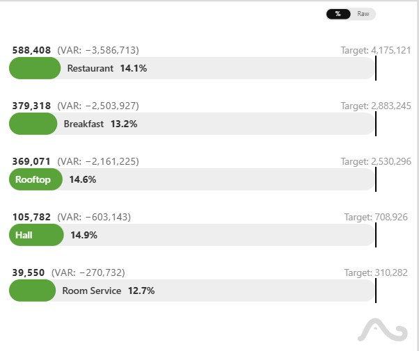
Mixxx DJ Set Analysis Dashboard
It is a dashboard designed for post-set analysis and self-reflection. I use it to gain insights into my DJing style, understand my flow, and discover new song combinations or artists to explore.
It tracks the entire history of my sets played at Swing & Blues events using data exported from Mixxx, allowing me to analyze individual performances and discover long-term trends.
Learn more about the Dashboard →
Tech & skills: Data analysis, data visualization, Python, Dash, Plotly, SQL. View code on GitHub
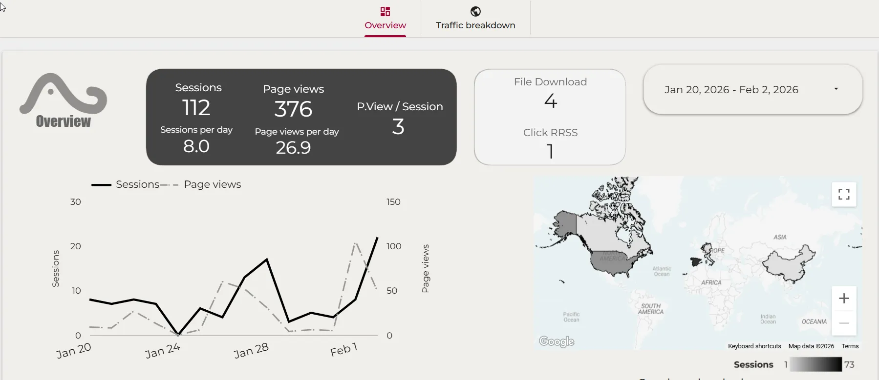
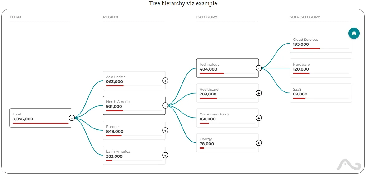
Web Analytics Dashboard
A near real-time analytics dashboard for this portfolio website, built with Data Studio and powered by GA4 data exported to BigQuery.
It features a custom session channel grouping and a custom Tree Hierarchy visualization to break down traffic by device, browser, OS, and location.
Tech & skills: Data Studio, BigQuery, GA4, SQL, Data Visualization.

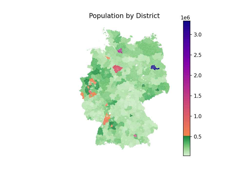
Historical rent analysis
Analysis of historical rental data in Germany and price outlier detection (ongoing).
The purpose of this project is to study the evolution of rental princes and the detection of outliers. Eventually i'd like it to be a tool for people to estimate if a property of their interest is reasonably priced.
Tech & skills: Data analytics, Data science, Python, Scikit-learn, Pandas, geopandas, Jupyter-notebook.
App development

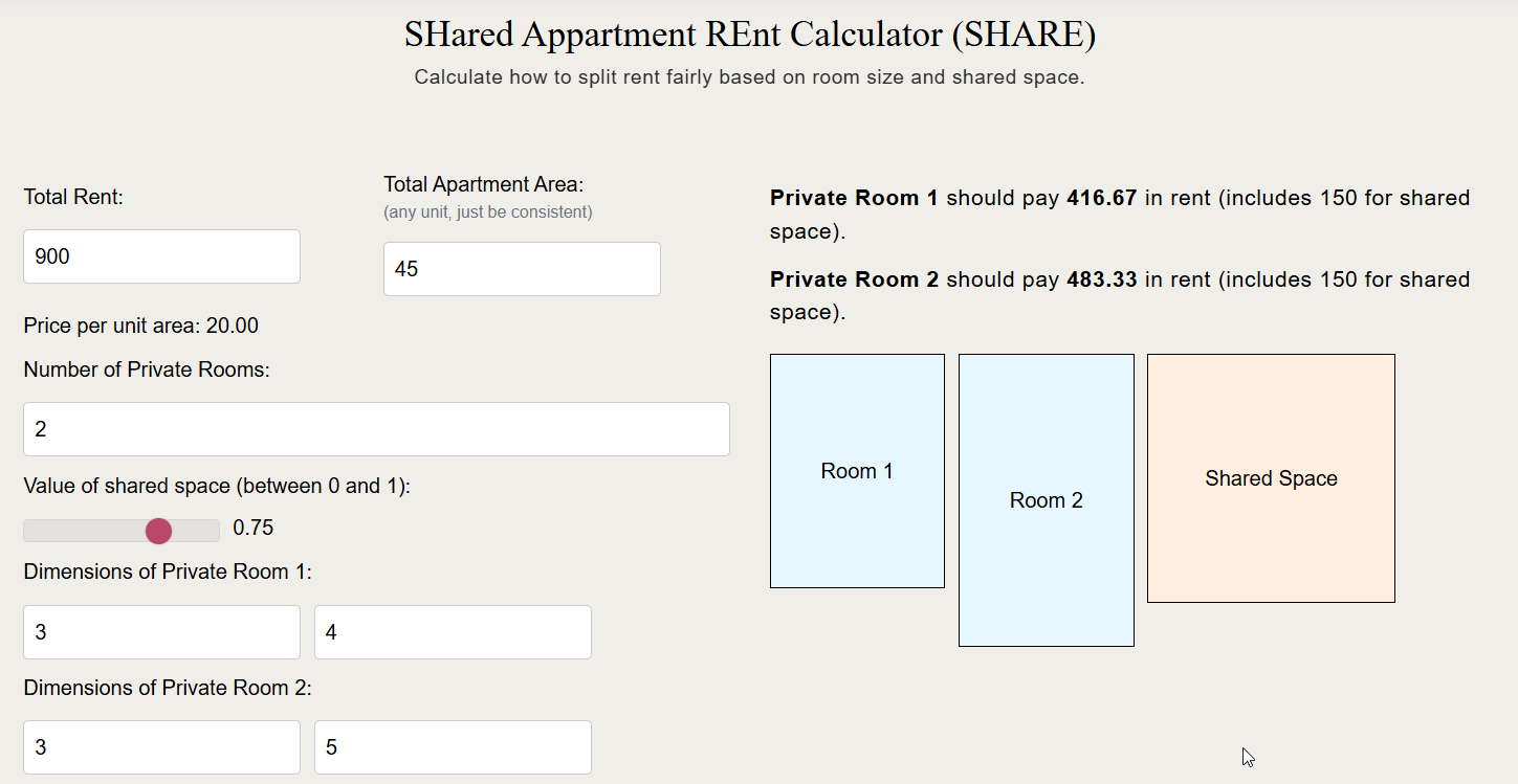
SHared Appartment REnt Calculator (SHARE)
Simple calculator to approximate the share of rent each tenant should pay, given the area of their room and the total rent of the appartment. It is also possible to add extra shared taxes like intenet or council tax to the calculation for budgeting purposes.
The app Is inspired by my experience trying to find a accomodation in cities where rent is very high and sharing accomodation is commonplace. It is meant to be a first guess at what a fare share of rent would be for each flatmate. It doesn't take into account features like insuite bathrooms, balcony, etc..
Tech & skills: Javascript, HTML
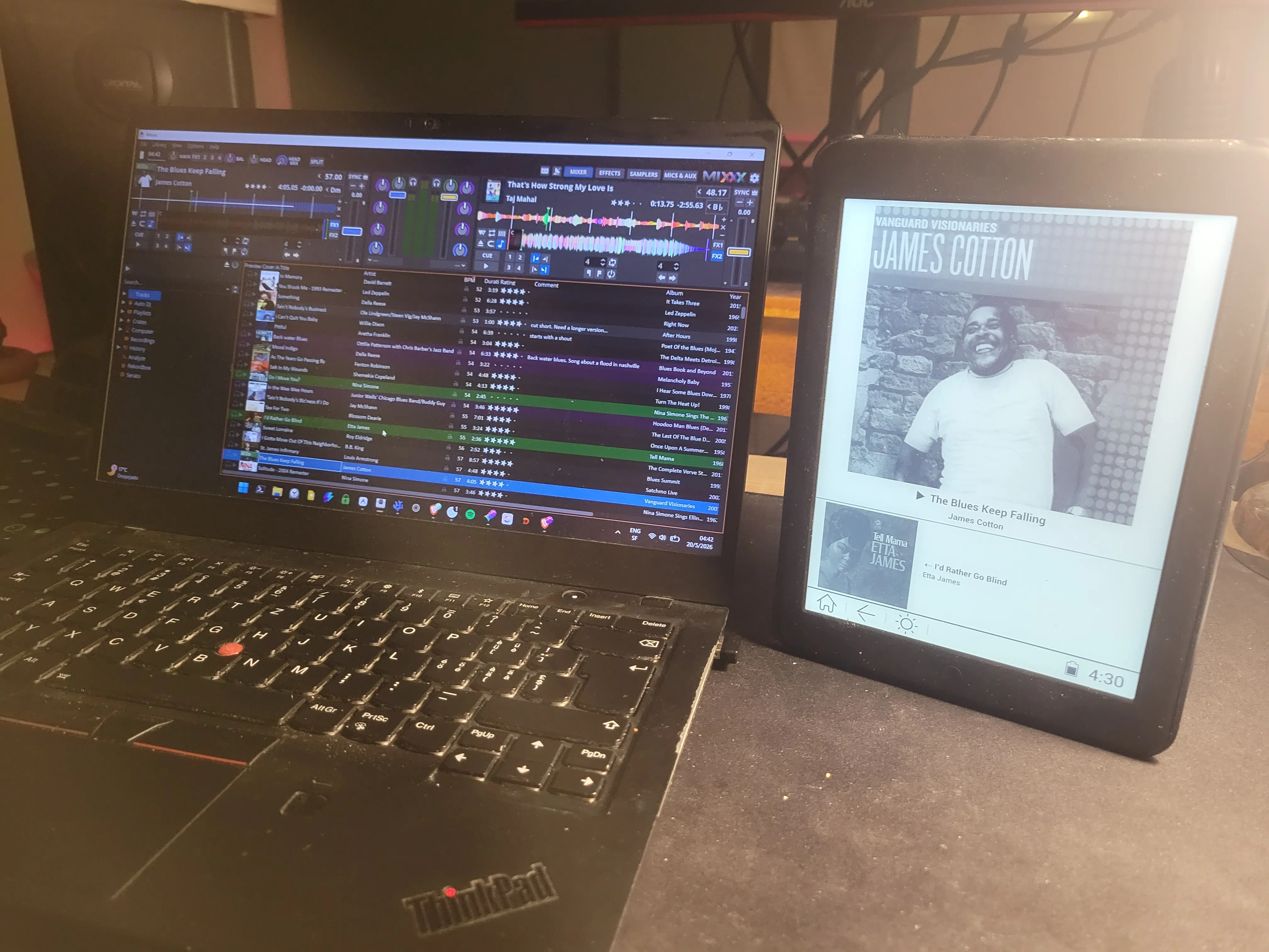
Mixxx DJ Buddy
A live companion app for Mixxx (free, open-source DJ software) that visualizes BPM trends and track metadata in real time as you play, reading directly from the Mixxx SQLite database.
Hover over data points to reveal which crates and playlists each song belongs to — helping you understand the story of your set and plan the next move on the dance floor.
Learn more about Mixxx DJ Buddy →
Tech & skills: Go, HTML, D3.js, SQLite. View on GitHub
Mixxx Remote Display
An Android companion app that turns any phone, tablet, or e-reader into a dedicated "Now Playing" screen. It allows dancers to identify the music they are dancing to without needing to ask the DJ or have an internet connection.
Optimized for low-friction discovery, the display updates automatically over Bluetooth SPP, making it a reliable choice for dance halls and venues with no Wi-Fi.
Explore the Discovery Screen →
Tech & skills: Android, Java, Bluetooth SPP, Mixxx. View on GitHub
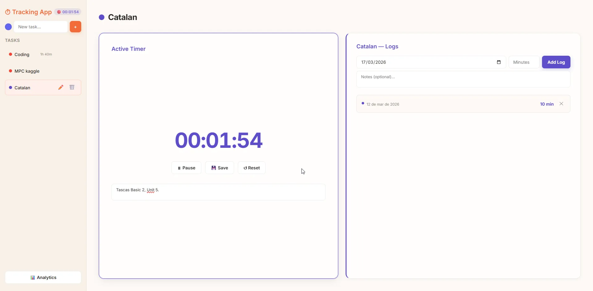
Task Tracker
Python app to track time spent on tasks. One can add what taks it wished to track, and the amount to time spent on each task each day. It is meant to be a tracking app for desktop only, to avoid interactig with a phone. It also allows to plot time spent on each task, to be able to visualize progress and consistance.
Tech & skills: Full stack, Python, Pandas, json
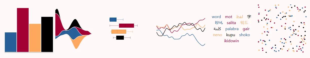
Data Visualization Development
The Seville Palette
A categorical color palette inspired by the history and landscapes of Seville, visualized as a network of accessible contrasts.
Tech & skills: Data visualization, D3.js, Color Theory, Astro.
Power BI Custom Visuals
A collection of open-source custom visuals for Microsoft Power BI, including the Lipstick Bullet Chart and Intensity Matrix Heatmap.
Tech & skills: TypeScript, D3.js, Power BI SDK, pbiviz, Data Visualization.
Data Studio Community Visualizations
Custom community visualizations for Google Data Studio, including tree hierarchy, histogram, and lipstick chart visualizations.
Tech & skills: JavaScript, D3.js, DSCC API, Data Visualization.
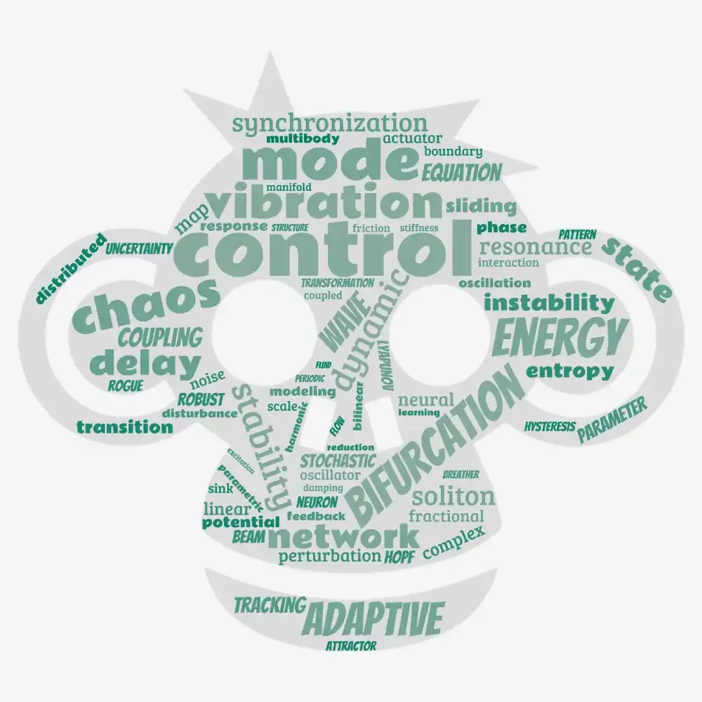
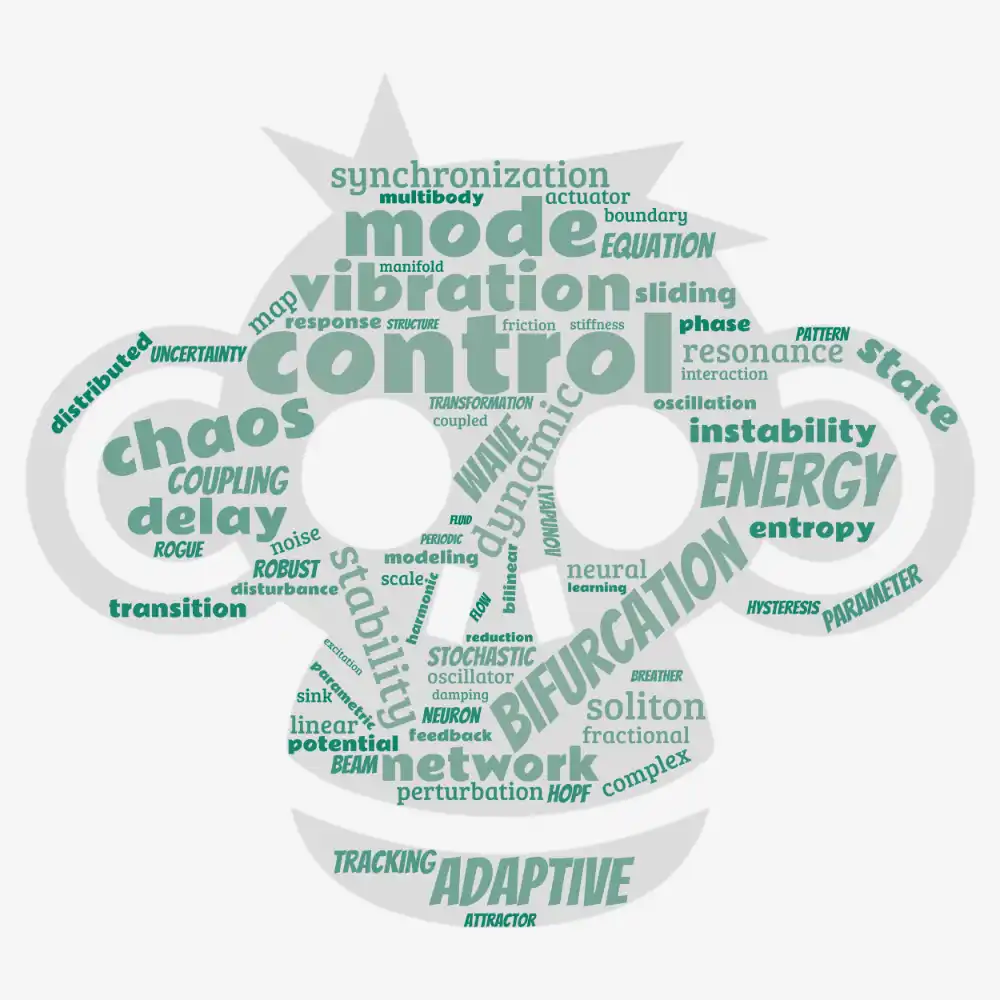
Wordcloud Journal webscrapping
Web scraping project to visualize journal keywords from Nonlinear Dynamics journals.
Tech & skills: Web scraping, Data visualization, Python.

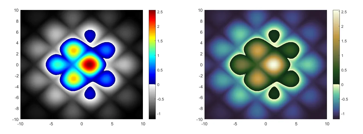
Custom colormaps code
This is a Python and Matlab code to make a new colormap by stitching together two pre-existing colormaps. It allows joining two diverging colormaps, but being able to change the colorbar limits and the pivot point of the divergence.
It is usefull for data that has relevant information in very different ranges, or has a natural threshold that divides the data (For example topography with a water level.) Click on the image link to access the github repository.
Tech & skills: Data visualization, Python, Matlab.
Plots & Visualization
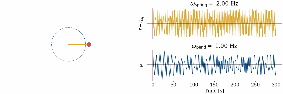
Spring Pendulum
Visualization of the dynamics of the spring pendulum system
Tech & skills: Data visualization, Python, Matplotlib.
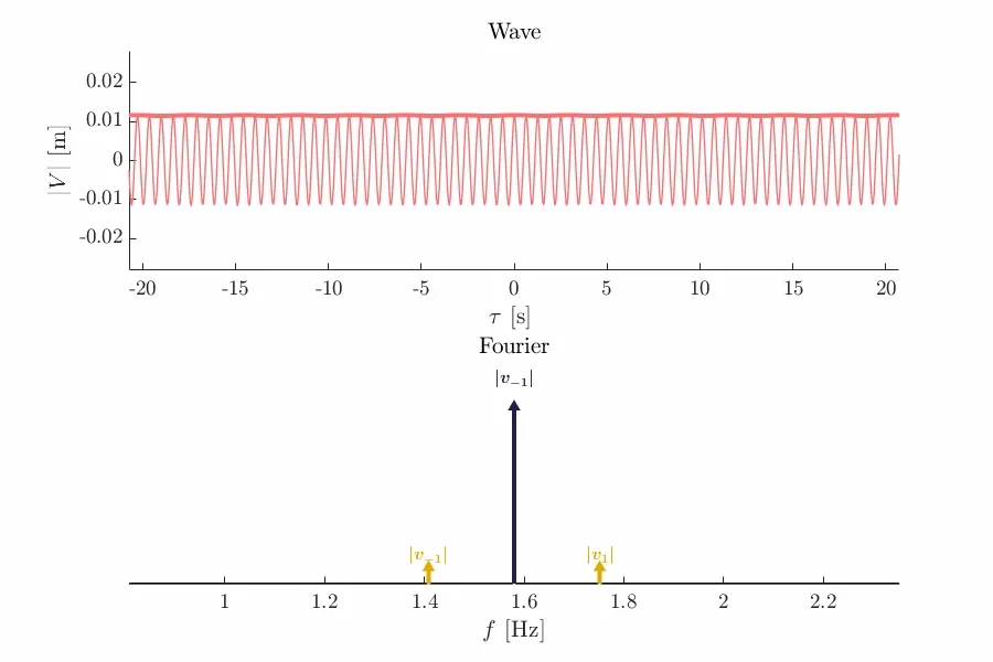
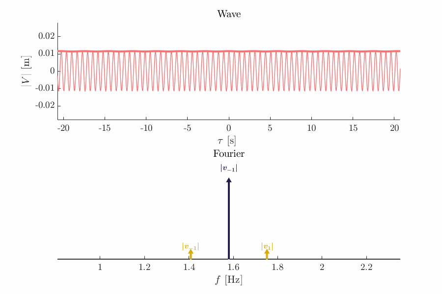
3 Wave stabilization
Modulational instability animation. Showing the nonlinear interation between frequencies of a propagating wave in a self-focusing regime.
Tech & skills: Data visualization, Differential equations.

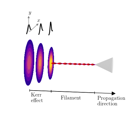
Laser filamentation scheme
3d Laser filamentation scheme made in Python.
Tech & skills: Data visualization, Dessign, Python, Matplotlib.
Data visualization resources
Collection of useful resources for data visualization